BambooHR
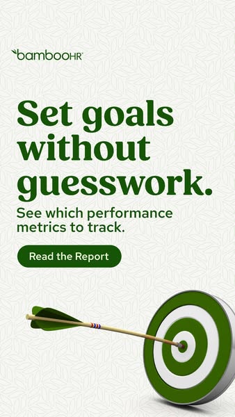
This is the reference ad. We’ll use its patterns to generate new creatives.
Measurable traits
| Format | single image |
| Dimensions | 338 × 600px (9:16 portrait) |
| Word count | 14 total (logo 1, headline 4, subhead 6, cta button 3) |
| Focal points | 1 (Target/arrow visual) |
| Palette | #F3F4EF#708E5F#F4F5F0 |
| Contrast (top 2 colors) | 3.32:1 |
HR Tech · single image · 9:16 portrait · PRODUCT
Transferable rules
| Rule | Use when | Avoid when |
|---|---|---|
| State the offer directly in the cta button ("Read the Report") instead of a generic prompt. | the offer itself is the strongest selling point. | the product needs more context before the offer makes sense. |
| Pair a short headline (4 words) with a subhead (6 words) that adds the detail the headline leaves out. | the headline alone would be ambiguous or too broad. | the headline already fully states the offer — a subhead then just repeats it. |
| Place the logo first in reading order, before the headline. | brand recognition matters as much as the message. | the brand is unfamiliar and a generic logo placement wastes the first glance. |
| Layer multiple proof/detail elements (5+) rather than one single focal point. | the audience needs several reasons to believe the claim. | the ad will be viewed at small feed size, where dense layouts lose legibility. |
Design brief
Builds a starter brief from this ad’s copy, tags, and breakdown — sections with no source data here are left as fill-in placeholders.
Use the same structure, hooks, and design principles from this ad to generate new ad creatives for your product.
Your logo is placed into the final creative exactly as uploaded — it is never redrawn or altered by AI.
Creative freedomi
Generated creative will appear here
You’ll get a new ad creative inspired by this ad’s patterns, along with variations and the reasoning behind the choices.